Here's how to use data from OpenStreetMap for your infographics
The goal
States, provinces, counties, cities and urban districts – there are many areas for which it would be great to visualize data on maps. But you do not always have the boundaries of the areas you need in the right format for a tool you use. Here OpenStreetMap is a great help. You can find detailed boundaries even of urban districts for free. For example for all the 59 districts and cities in the German state of North Rhine-Westphalia. I’ll use this example to show, how to use OSM. You can pull boundaries from OSM with the free tool OSM Boundaries (Thanks for the tip, Joost!), programmed by Walter Nordmann from Germany.
Selecting the boundaries
Using OSM Boundaries is simple. Type the name of the city or state or district you are looking for in the search slot above the map. Then OSM Boundaries shows you the correct entry from OSM in the directory tree on the left. Here you select the boundaries you want to export. Important: The tree is hierarchical and you must select all the levels you need. If you select a city and need the boundaries of the underlying urban districts too you have to select them separately.

My example: I have a record of micro-census data on net income for cities and counties in the state of North Rhine-Westphalia. I want to show the differences on a map. So I use the directory tree on the left and select NRW first, then I right-click and choose “Select Children”. This opens the sub-bounderies of government districts and selects their boundaries. But I still need the underlying layer. To achieve this, I right-click on each administrative region and chose the option “Select Children”. I don’t select underlying boundaries because the data on net income is only available on a city and county level.
Exporting the polygons

Once you have selected all boundaries you need, you can click the of export button on the bottom left. Now you have to select the file format you want to export to. This depends on which tool you want to use to combine boundaries and data. Since I work with the free Google Fusion Tables, I need the boundaries of counties and cities in the KML format. OSM Boundaries does not offer direct export to KML, but the available JSON format is a good basis for the conversion.
Converting
You have many options. You can export a Shape file from OSM Boundaries and transfer this directly via Shapescape to Fusion Tables. Another free converter is offered by the Swiss Hochschule für Technik Rapperswil. Upload the exported json file from OSM Boundaries, select and download the KML. It’s easy as that. If there are errors with the conversion of your boundaries, try geojson.io instead.
Combine boundaries and data
Now you have the KML file with the boundaries and the data you want to visualize (in a CSV file). You have to merge the two files into one in the next step. Google’s free tool Fusion Tables does this quite well.
The KML file can be uploaded directly. But I had to clean up the csv file with my data first: Deleting blanks, reshaping the data so that you have just one value per line and so on. Datawrangler is a great and free tool for this (here is an How-to).
Here are the most important steps when preparing Data with Datawrangler:
1.) Select the first row (containing years) and click on promote in the menu above, then on promote row #1 to header on the left.

2.) Next step is the real reshaping of the data. First select all columns containing figures by clicking on every year in the first row with the apple or shift key pressed.

When all columns are selected you choose fold from the menu above and then the option fold 2001, 2002 (and so on in my example) using the header as a key. It should look like this:

3.) You export the data with a quite small export button on the left.

Before you merge the two files, you should check if data and boundaries can be assigned properly. This depends on the values indicating the city or county being exactly the same in both files. In my example, I want to merge the boundaries of a city like Essen with the net income data for Essen. So the value “Essen” should be written exactly the same in both files. In my data there was a difference: In on file the counties were named “county XY”, in the other just “XY”. So I deleted the “prefacing county” in one file.
. 
After deleting the prefix “county” I combined the files via the merge command in Fusion Tables, based on the value for LocalName.
Visualizing
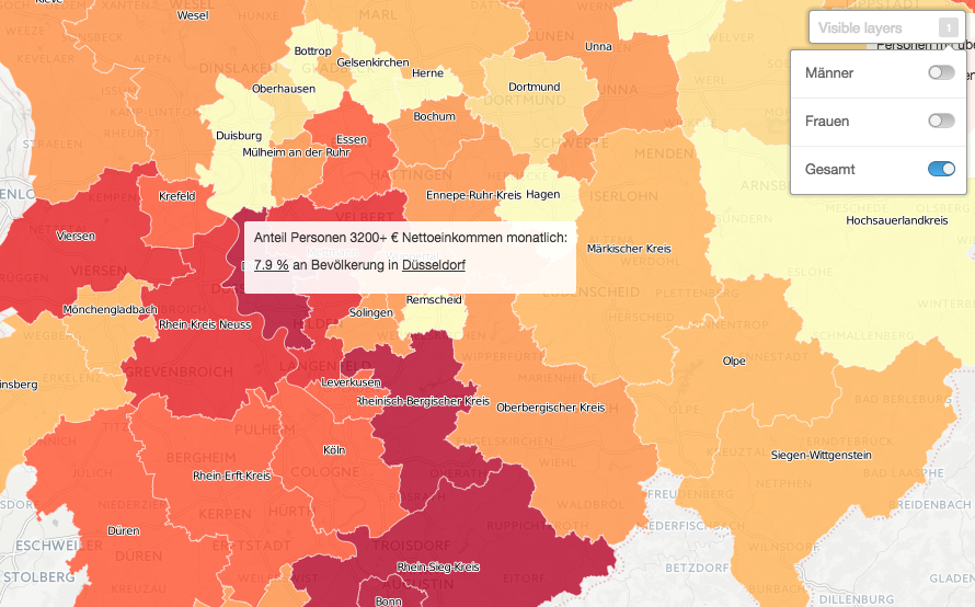
You can export the merged data as a CSV file and upload this to a visualization tool like CartoDB. It’s free in the basic version and easy to use. What you see is what you get here. I used it for this visualization of the data (here is an introduction to CartoDB in German):
German version here.
Published under CC BY-ND 3.0, author is Konrad Lischka, please link to: http://www.konradlischka.info/b/1jN
- Auf Twitter teilen
- Auf Facebook teilen
- Auf LinkedIn teilen
- Auf Pinterest teilen
- Per E-Mail teilen
- Link kopieren


